Showing posts with label Bosskut. Show all posts

Friday, January 20, 2012

Under God's Feet # 2


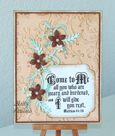
I will begin with the card base. It is
craft paper card stock. The edges have
been sponged with Ranger Archival black ink.

The texture layer is an embossing folder.
This was layered over black card stock and
a narrow border was cut using Perfect Layers rulers.

Over this layer is a band of DP from Paper Studio's
Everyday Kraft stack. Again it has been mounted
on black card stock and trimmed to a narrow border
using the Perfect Layers rulers.

The phrase has been created in PSP X. It is one
of my very favorites.
It was cut out with a Spellbinders die and
mounted on black card stock, then cut
to a narrow border with those Perfect Layer rulers.

The flourish is a single Bosskut die that is
wrapped around the phrase.

The final touch is three black rhinestones
in the upper right corner.

Friday, May 13, 2011

Precious LIttle Girl


Begin with a white A2 card base.
Now take a Sizzix embossing folder
and cut the textured white card stock
to 4 x 5.25 inches.
Lightly sponge with a pale pink ink.
I wanted the embossing to show ever so slightly.
Attach it to a dark mauvey-pink
card stock and trim to a narrow border.
I use Perfect Layers rulers to get
exactly the same width with every cut.

The stamped image is from an old
company called Second Star On The Right.
I don't know if they are even in business anymore.
I purchased several sheets of unmounted
rubber from them about 10 years ago.
I used glossy paper and Rangers Archival
coffee ink to stamp this precious little girl image.

The oval within an oval frame was made using
two Spellbinders oval dies at the same time.
Position as the ovals are shown on the card.
Leave the dies attached to the paper after cutting
and emboss with the soft rubber embossing mat.
Sponge a soft pink ink on the outer and inner ovals.

Use one of Spellbinders Fancy Tags 3 die cuts
that has been cut in half to make the
flourish on the thick side of the oval frame.
I cut a small part off on each end to get
just the right look.
Sponge with the same pale pink ink.
Attach to the wide side of the frame.

I use the flat parts of paper egg cartons for my
3-d effect. This design has two layers
of egg carton to get a more dramatic look.

The pale green flourishes are from Bosskut.
The very pale pink flowers are from Punch Bunch.
As you know by now I really like Punch Bunch.
They have a very good product, their punches
always punch clean and seldom stick.

Monday, May 2, 2011

Come unto Me


Love this new Sizzix embossing folder!
It is the bottom textured layer.
The narrow dark reddish brown bottom
layer is the same paper that was used for
the large punched flowers.
The texture was lightly sponged to
make it stand out a little more.

The phrase was computer generated in PSP X,
cut out with a Spellbinders Label
and the edges lightly sponged with brown ink.

The two sizes Punch Bunch fern type leaves and
the Bosscut flourish are
cut from a light green metallic card stock.

The smaller Punch Bunch flowers are
white card stock and the edges
were sponged to make them stand out a bit.
Pearls were glued in the center of each flower.
I have discovered that the adhesive on these
lovely little embellishments doesn't hold very well
and have started to just glue them in place.

Saturday, April 30, 2011

With Sympathy


Layers, embossing folders, punches and die cuts.
Ahhhh....so much fun!

The die cuts are from Spellbinders and Bosscuts.
The punched flowers are Punch Bunch
while the butterfly punch is unknown.

The same embossing folder was used for
the white and the peach texture.

The bottom layer -
Cut the white texture to 5 1/4 x 4 inches,
attach to peach cardstock and
trim to a narrow border with Perfect Layers ruler.
Attach to card base.

Cut two different sizes of Spellbinders
beaded ovals. Now cut ovals that fit
inside the beaded ovals from
peach card stock.
Texture the peach ovals in the same
embossing folder that was used for
the white textured layer.

I used cut up paper egg carton to
get the 3-D look on the ovals.

Fancy Tag 1 was the die cut used for the
base of the phrase.
Mega Oval die cuts plain and scalloped from
Spellbinders were used to cut the phrase
and the peach scalloped layer under it.

Bosscuts is the maker of flourish die cut
in the center of the largest oval.

The Punch Bunch flowers are
made from silver Lumiere painted
white card stock.
For extra sparkle - sprinkle with
glitter while the paint is still wet.

Thursday, August 26, 2010

Love Those Butterflies

The above card began with a white card base.
A 4.25 x 5.5 piece of cardstock that had been
"beautified" with Glimmer Mists by Tattered Angels
was then attached to the card front.

The white flower under the butterfly is Spellbinder's
Lotus Pendant. The butterfly itself is a two part die
from Quickutz, I recommend using text weight paper
to the cut the black portion. The colored part of the
butterfly is glossy paper that has been turned into
the Polished Stone look with alcohol inks.

The stamped phrase from Hero Arts
has been embossed with a fineline black embossing powder.
When a process used to create the background has
metallic properties a dye ink tends to "sink" beneath
the metallic and become hard to see, so
for these types of backgrounds I always heat emboss
some type of powder to make the image stand out.
Both Glimmer Mists and alcohol inks with metallic
will "fade" dye inks.

The jewels on the butterfly's body are from an unknown maker.

The only difference in this card from the one above it
is the color of the Glimmer Mists used to
create the background and the Bosscut"s flourish die cut
under and around the butterfly.

The background for this card is a scrapbook paper.
Note the rounded corners of the card base
and the blue paper used for the background.
The stamped phrase is from Stampabilities.

Sunday, March 7, 2010

Isaiah 4:10


Begin with a craft paper tan card base. Sponge about the edges. Now add a Blossom die from Spellbinders cut from DCWV Linen Closet stack paper and sponge those edges. A brown or a black ink will work, just something to add a little more definition and depth to the die cut.

The phrase from Our Daily Bread Designs was cut out with another of Spellbinders Nesting Label dies. It was also has sponged edges.

The leaf flourish die cut is from Bosskut and is the perfect finishing touch.

Monday, December 7, 2009

Beautiful Little Girl


Another stamp by Second Star On The Right. The stamped image did not turn out well when I reduced the size of the photo.
The die cuts are from Bosskut. The card base is paper from a DCWV (Die Cuts With a View) stack called Old World. The three pearls are from Creative Impressions.
The edges of the card base and the oval stamped image have been sponged to give vintage look and to add depth.
I usually stamp the highly detailed "art" stamps on glossy paper and put the ink on the stamp with a brayer.

Friday, November 27, 2009

Dictionary part 3


Some more dictionary pages that have become backgrounds. The die cuts are from Bosskut, the background stamp is from Stamp Camp and the little girl image is from Second Star On The Right.