Showing posts with label embossed. Show all posts

Sunday, June 6, 2010

Alike Yet Not Alike

Here is another set of cards in a series that
I had so much fun creating.
All the cards have a "left-side bar"
and that is all that is exactly alike on them.
In the above card the flower print is
echoed in the punch on the right side.
Cream paper with brown ink was
used for the Hero Arts phrase.
I liked the cream and brown combination
for a softer look.

The square side bar on the above card was from
A DCWV mat stack. The small squares are echoed
in the embossing of the back ground paper.
Squares are sharper, more precise, so a white
card stock and black ink was used for the
Hero Arts stamped phrase.
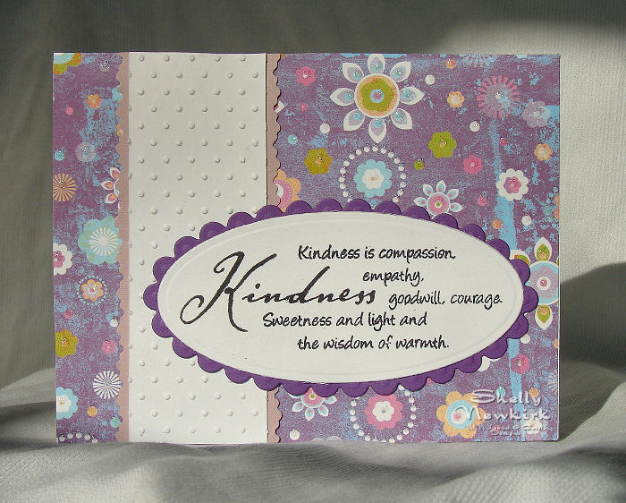
Oh my, a background paper that is NOT embossed.
This paper is from DCWV. Note the embossed
white paper on the side bar. Small ripple decorative
scissors by Fiskars were used to trim the mauve layer
under the dotted Swiss embossed paper.
The phrase was layered over dark purple
for a little more contrast and
just because I thought it looked better that way.

This side bar print paper was a left over piece
from the background paper on the previous card.
It was layered onto white and then dark purple.
This really pops the white in the print paper.
Pale lavender checkerboard embossed card stock
was used for the background.
The oval die cut and the scalloped oval die cut
are from Spellbinders Mega Oval series.

Saturday, December 5, 2009

It's Christmas Time Again


The front of the card base is covered with scrapbook paper. The edges of the card have been sponged with dark green ink.


Stamp credits - phrase by Paper Impressions
I can not find this company on Gingerstamp.

Gingerstamp is a website with a very current links to most current stamp company and accessory websites. It is a wonderful resource.

pine bough - PSX Personal Stamp Exchange - the date on the stamp is 1996, I have had this one for a while and it is still a favorite.


The phrase is stamped with dark green ink. The pine bough is embossed with a dark green sparkle embossing powder.


Now for that fancy edged white cardstock piece that has the phrase stamped on it. (please note that the edges are sponged with dark green ink) Sigh, you are going to hate me for this little bit of enabling. This fancy edge has been done with a set of two punches from EK Success's Martha Stewart line. They are called Punch Around The Page. I love the product. The set runs about $25 - $27. I found mine at Michael's and had a terrible time deciding which set I wanted. There are some fantastic punches in this new line. Get out your coupon cutter cause you are going to want all of these, they are unlike anything else out there.

Monday, October 5, 2009

Sharing the journey


Such a simple card, yet so elegant.
Scrapbook paper is glue to the front of the card base. The edges are sponged with dark brown ink to add depth and interest. The maroon strip has a deocrative accent cut with the Create A Cut paper cutter. If you don't have that product you can draw two parallel on the back of the paper and use those as cutting guide lines.
The phrase is by Viva Las Vegastamps. It was stamped with VersaMark and embossed with fineline black powder then layered on the same maroon paper as the decorative accent strip.
The little pearly dots are Liquid Pearls by Ranger. This particular color was white opal.

Saturday, July 18, 2009

Psallm 118:24


More scripture cards!!! After stamping several 12 x 12 sheets of scrapbook paper I had to do something with them. At the time that I stamped and embossed these I was sure that the paper would be easy to work into some great cards. These have laid around staring at me for several months. One day I just couldn't take it anymore and started playing.
The card on the left has a white card base. The texture is from one of the new Sizzix Texturz plates. (they had a LOT of texture plates now and they are slightly larger than an A2 card, love it, love it, love it) I used dark green and some olivey-type green card stock for the layering.
TIP: to get ink only on the raised portion or your textured paper, use a brayer with a very light touch. Don't try to get all the ink on in one go. Lightly go over and over the texture. This way your brayer won't dip down and color unraised parts of your paper.


The background on this card is a very formal mum stamp. I used Clearsnaps Olive Pastel Colorbox Chalk Ink and just stamped until the entire card front was covered.

The little ribbon on the right side was cut from dark green card stock with deckle scissors. Very simple and it adds the finishing touch.

I am not sure that I like the epoxy stickers, but they are on there now, so I guess they are ok.

The Psalm 118:24 stamp is by Stampabilities and the mum stamp is by Rubber Stampede.