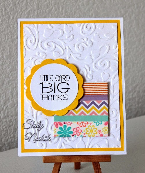
Same basic design, just different colors
and different Washi tape.
The center card is a cream base while the top and bottom
cards a white.
I used a different embossing folder
with each card.
I do like the washi tape in the horizontal
better than the vertical.
The square that the Washi tape is wrapped around
is thick cardboard.
The phrase is raised with my usual
flat pieces of paper egg cartons.
While I am not a big fan of bright yellow,
I just love the yellow card.
Next I want to try some with the phrase
printed on kraft paper card stock.
Still working on the particulars of that one.


No comments:
Post a Comment