Wednesday, August 31, 2011

Double Gate-fold Cards

Three variations for
the double gate-fold card.
This card is sooooooo easy and
can be as detailed as you want to make it.
I got this idea and the instructions
from Technique Junkies
Fancy Folds and Motion Paper Crafts CD.
Great CD. I can highly recommend it.

The base for the card is 5 1/2 x 12 inches.
Score for folds at 2, 4, 8 and 10 inches.
All of the papers used on cards in this post are from
DCWV Citrus Stack and Citrus card stock stack.
Punches are from EK Success and EK Success
Martha Stewart line.
Some Spellbinders Labels have been used as well.


Friday, August 26, 2011

Wheat Thank You


I work for Nebraska Agricultural
Statistics Service. One of the many
different thing that I do is called
Wheat Objective Yield.
This involves me going out into
15 to 20 wheat fields every summer and
setting up small sample plots.
Every month I do counts of the
stalks of wheat, check maturity and
send small samples to a lab for examination.
From all of this data that I send in,
Nebr. Ag Stats and USDA can
make a fairly accurate estimate of
the wheat harvest.
While wheat harvest is over,
I am now involved in
Corn Objective Yield and am preparing
to go out into some corn fields and
set up sample plots.

The above card is the thank you
that I made and sent to every
farmer that allowed me to play
in their wheat field.

The wheat in the oval is embossed
with a goldish emblossing powder that
I got years ago from Think Ink.
Then the shadow wheat
stamped on the card base are
Distressed Ink Straw.
These where ink, stamped on
scrap paper and then stamped on
the card base for a very light shadowy image.

All of the sponging was done first with
Rangers Archival Russet and then just the
very edges with Rangers Archival Coffee.

The thank you is an unknown stamp.

I used two different Spellbinders Label dies
to cut the corrugated cardboard.
I think I like the second one better.

Wednesday, August 24, 2011

The Lord Is My Strength

Here is another of the very detailed
and delicate cards that were inspired
by a card I received from
from my stamping pen pal,
Celia M.. She had no clue
what she started. This can be very obsessive.

The phrase has been designed in PSP X.
Spellbinders is the maker of the delicate
die cut square. I used two different
embossing folders. The flowers
and leaves are from Punch Bunch.

Tuesday, August 23, 2011

Cowgirls Rule


This has to be one of my favorite stamps.
These cowgirls are just so cute.
The images have been colored with
colored pencils and blended with
baby oil on a blending stump.

The phrases are computer generated.
The dies are Spellbinders and Bosscuts.
Faux snake skin has been used on the
2nd and 3rd cards.
Most edges have been sponged with
a dark brown ink.


Monday, August 22, 2011

Black and White Elegance

I really really do love the elegance of
a black and white card.
The papers on these cards are from
an older stack call Formal Affair
by Scrap Works.

Note that each of the papers has been layered
onto plain black. I cut the very narrow
border with my Perfect Layers ruler.
The gross grain ribbon was attached to
the bottom two layers before
it was put on the white card stock base.

The phrases were created by me in
Paint Shop Pro X, then
cut out with Spellbinder's
Nesting Ovals.

These were very simple cards that
are easy to mass produce.

Thursday, August 18, 2011

Double Gate-fold

The basics for this card came from
Technique Junkies CD.
Fancy Folds and Motion Paper Crafts.
Thanks to Ginni S. who got for
me as a Christmas gift. It is a great CD
with lots of innovative ideas.

The paper is from DCWV Citrus Stack.
The punch is an EK Success from the
Martha Stewart line.
The scripture was created by me in
Paint Shop Pro X program.

Basic instructions-
5 1/2 x 12 inch piece of paper
score at 2, 4, 8, and 10 inches
the rest you should be able to figure out from
the pictures.

Wednesday, August 17, 2011

Waving cowboy


I began this card with a discontinued crackle paper
from Karen Foster Designs.
It was attached to the card front, then
sponged with Ranger Archival coffee color ink
around all four edges.
A mountain scene (stamp unknown) with buffalo
grazing was stamped with VersaMark and
embossed with fine line white embossing powder.

The cowboy, image by Viva Las Vegas Stamps,
was stamped in Ranger Archival black ink.
It was colored with colored pencils,
a blending stump dipped in baby oil
was used to smooth out the pencil strokes
and blend the coloring.
The waving cowboy was torn out of the
piece of white card stock and the edges
were "burned" by sponging with Ranger Archival
coffee and black ink.


Wednesday, August 10, 2011

What's Been Going On Recently


My husband, pictured above, hit
a deer with his motorcycle August 3rd.
After a trip to the emergency room,
I have been the nurse.
Praise the Lord he
only suffered some severe road rash.
It could have been a lot worse.


Friday, July 15, 2011

The Lord is my strength


Let us begin at the beginning.
A purple card base.

Next layer - white card stock
in an embossing folder, lightly
sponged with a lavender ink, cut
to 5.25 x 4 inches.

Die cut the label, sponge the edges
with that lavender ink and glue
something to the back for a 3-D look.
(I prefer the flat part of paper egg cartons, inexpensive
and I am reusing those egg cartons)

Place a purple oval in the center of the die cut.

Use a rectangular die cut on the computer
generated scripture.
Sponge the edges with the lavender ink.
3-D it with pieces of paper egg carton or foam and
attach to the purple oval.

Place punched or die cut flowers
and flourishes as desired.

The flourishes at the top and
bottom of the first die cut layer are
a Spellbinders Fancy tag that I cut in half
and attached. It has
been sponged with the lavender ink too.

I do like the combination two colors and sizes
of flowers. I used a medium lavender
and cream for my flowers.

Saturday, July 9, 2011

Another Bucking Bronc


Another cowboy atop a bucking bronc.
The computer generated phrase really fits the stamped
image. This card was made using the same
design and construction techniques as yesterdays post.

Friday, July 8, 2011

Cowboy Wisdom


There are a number of phrases that come
from the cowboy, cowgirl and western experience.
Life on a ranch leads to a very practical blunt wisdom
that sometimes has to lived to be understood fully.
It's a lot like living the Christian life. You
just can't completely comprehend it until you have lived it.

This phrase is very appropriate for any new venture.
Once you are on that bronc the are only two final
results. You are either eating dirt or you
tough it out until the bronc is no longer bucking.
So when you mount up, you had better
be real sure it's worth the effort, cause
comin' down is not going to be a painless thing.
Is it worth it?

The background on this card is faux snakeskin.
For a basic tutorial go to Stampers Quest and do
a search for faux snakeskin. The edges
of the card have been sponged with black ink.

The bucking bronc image is from Bear Rubber.
It is stamped on ivory card stock and metallic fleck rust
embossing powder makes the image stand out.
Tearing out the image and "burning" the edges
with brown and then black ink adds to the
worn western look.

I cut closely around the PSP X computer generated
phrase and burned the edges on it as well.

The "ribbon" an EK Success punch layered over
light kraft card stock. The edges of the light
layer have been sponged with dark brown ink.

Thursday, July 7, 2011

Cowboy card

Fourth of July in western Nebraska means the
Morrill County Fourth of July rodeo.
The Morrill County Farm and Ranch Association
has been putting on a 4th of July rodeo
for as long as I can remember.
The volunteer fire department always
puts on a tremendous fireworks display
at half time each night.
The Boy Scouts have always had
a concessions stand.
AND the bugs attack everyone that
is in the stands, practically eating one alive.

This card is my tribute to the dedicated men and
women of Morrill County that have consistently
put on a wonderful show for the entire
Nebraska Panhandle for many years.

The bucking bronc image is from a company
called Bear Rubber. I do not know if they are still
in business. This image has a kind of Russell feel to it.
It was stamped on a light colored kraft card stock
and embossed with a metallic flecked rust embossing
powder. It was then torn around and the edged
"burned" by sponging first dark brown and then
black ink around the outer edge.

The phrase has been computer generated in
Paint Shop Pro X. It was cut out in a rectangle
and the edges of it was also "burned".

The punched "ribbon" is from and EK Success punch.
It definitely has a western look to it.
I also sponged the edges of the card base.
The sponging really pulls the whole card together
and adds depth.

Wednesday, June 15, 2011

Wild Women of the West Stampers


Well here I am at stamping.
Our group meets every Tuesday, rain or shine,
at a church in Scottsbluff NE.
We pay "rent" by supplying the
pastor with cards.

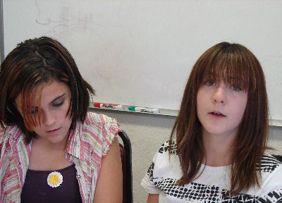
Above is Ann Jaramillo, a relatively
new stamper, but wow does she have a lot of
talent and great ideas.

This is Donna Feagin.
She has been a Wild Woman for years.
A lot of Donna's cards are sent to members of
her church. She has some fantastic
cards for the younger members of the church.
Here is Angie, Ann's daughter, Ann
and Ann's lovely granddaughters,
Brandi and Kaylee.
Angie was visiting from the Denver area.

Brandi and Kaylee, very talented
young women that have a lot of potential.
They join us when they can and we love it.

Not pictured are Phyllis, Eva, Charlene, Marsha and Nancy.

Center Step Cards


After two frantic weeks,
I am able to return somewhat to blogging.
There are still some very time sensitive
surveys and Wheat Objective Yield
sample plots to work in a week.

I found the instructions for this fun design on
the Our Daily Bread Designs blog.
It was featured a few weeks later on Splitcoast.

If you have any questions about products used
please leave a comment.

Monday, May 30, 2011

Thinking of You

Something a little different.
The square die cuts are from Spellbinders new
Fleur de Lis squares.

Lots of sponging and 3-d layering.
Shapes are either die cut or punched.
Textures were done with several embossing folders.

Since I will be frantically busy as of tomorrow until at least
the 12th of June there are going to be several weeks without
posts. Probably won't be doing much card designing either.
Just working real hard on the job
and maintaining sanity.

Saturday, May 21, 2011

Inscribed On The Palms of His Hands


This has to be one of my very favorite scriptures.
For this card I used PSP X to layer by layer
create the scripture. It was then cut out with
a Spellbinders die. Pale pink ink was sponged around
the edge of this die cut and the inside and outside
of the frame.

Punch Bunch punches were used for the flowers and leaves.
The flowers were shaped with a rounded tool.
Stickles pearl was used for the centers of
the flowers.

Note that the embossed bottom layer has
been sponged with the pale pink ink as well.

The scripture and the frame have been raised
off the card using layers of paper egg carton.
This creates a stunning 3-d look that is
far more pleasing to the eye than
simply attaching the pieces to the card front.

Friday, May 13, 2011

Precious LIttle Girl


Begin with a white A2 card base.
Now take a Sizzix embossing folder
and cut the textured white card stock
to 4 x 5.25 inches.
Lightly sponge with a pale pink ink.
I wanted the embossing to show ever so slightly.
Attach it to a dark mauvey-pink
card stock and trim to a narrow border.
I use Perfect Layers rulers to get
exactly the same width with every cut.

The stamped image is from an old
company called Second Star On The Right.
I don't know if they are even in business anymore.
I purchased several sheets of unmounted
rubber from them about 10 years ago.
I used glossy paper and Rangers Archival
coffee ink to stamp this precious little girl image.

The oval within an oval frame was made using
two Spellbinders oval dies at the same time.
Position as the ovals are shown on the card.
Leave the dies attached to the paper after cutting
and emboss with the soft rubber embossing mat.
Sponge a soft pink ink on the outer and inner ovals.

Use one of Spellbinders Fancy Tags 3 die cuts
that has been cut in half to make the
flourish on the thick side of the oval frame.
I cut a small part off on each end to get
just the right look.
Sponge with the same pale pink ink.
Attach to the wide side of the frame.

I use the flat parts of paper egg cartons for my
3-d effect. This design has two layers
of egg carton to get a more dramatic look.

The pale green flourishes are from Bosskut.
The very pale pink flowers are from Punch Bunch.
As you know by now I really like Punch Bunch.
They have a very good product, their punches
always punch clean and seldom stick.

Thursday, May 12, 2011

A Rainy Day


A beautiful rainy spring day in western Nebraska.
Our average yearly rainfall is 15 inches.
That puts us in the semi-arid category.
At 7 this morning we had 1.11 inches of
wonderful healing rain.
At times there are huge snowflakes
drifting down.

This is the view from my covered deck.
I look out every morning and my heart swells
with praise to God. He has created such
beauty for us to behold.
These slow drizzly spring rains are perfect.
Not a drop of rain is wasted. It all
soaks in and heals our dry parched land.
Most of the corn has been planted and
the farmers have been worried that
there would not be enough moisture
to get it "up". Up - as in germinated.
Our pastures were so very dry and
the wheat was starting to show some stress
from lack of moisture.
Thank you Lord for this spring blessing.
Your people are grateful
for your lovingkindness and favor.

Tuesday, May 10, 2011

Another Birthday Card


Pale pink and white with a touch of very
soft green is the color scheme for this card.

A Sizzix embossing folder was used to create
the textured lower layer. It was placed over
pale pink and trimmed to a very narrow
border with a Perfect Layers ruler.
The above combination was attached
to a white card base.
(A2 or 4.25 x 5.5 inches, aka quarter fold card)

To cut the frame for the phrase I used
two Spellbinders dies at the same time.
I place the Label die cutting side down on
the paper, then placed the oval inside.
These were taped down with masking tape.
Destick your masking tape by smooshing
it on your arm several times to reduce
the level of adhesiveness.
If you don't do this, when you remove the tape
the top layer of paper will come off with the tape.
Run the combined dies through your die cut machine.
DO NOT REMOVE THE TAPE!!!!!
Take the whole thing and place
it cutting side down on an embossing mat
(soft rubber sheet) and emboss.
Now you can take it apart
and see your lovely frame.

I sponged the inside and outside edges of the frame very
lightly with light pink ink.
Double layers of egg carton were attached
to the back of the frame.
The frame was then attached to a
light pink piece of card stock and
the oval cut Happy Birthday was centered in the frame.
I put a single layer of egg carton on
the back of the phrase.

The flowers and leaves were punched
with Punch Bunches fantastic punches.
Flowers were shaped with a
extra large stylus type tool.
Gently rub the petals and center of the
flower until it "cups" around the tool.
Now flip it over and press in the center.
I used Rangers Liquid Pearls (white opal)
for the flower centers. Stickles or adhesive backed
rhinestones or pearls can also be used for the center
of the flowers.

TIP - recycle and reuse,
cut up the flat pieces of your
paper egg cartons for creating
3-D effects

Saturday, May 7, 2011

I Am Your God


Sizzix embossing folders provided the texture
for the peach covering the card base and the
peach squares.
Now the white portion of those two squares
are from cut with Spellbinders new
Fleur de Lis Squares. Just lovely. I
know I am going to be using these a lot.

The scripture was done in PSP X and cut
out with a Spellbinders Label die.

The butterfly is two different punches with
the larger butterfly run through with an
embossing folder for that textural look.

Flowers and ferny type leaves are Punch Bunch
and the barely visible flourish is from Bosscut.

Just about everything on the card has been sponged to
add depth.
The squares, scripture label and butterfly have had
tiny cut up pieces of paper egg carton attached
to the back to create a 3-D look.
I put little pieces under each of the butterfly
wing layers to keep those wings separate
and 3-D even after mailing.