Thursday, April 4, 2013

Nothing Hidden

Cream and burgundy are the colors used on this design.
The cream card base is the foundation.
A cream 4 x 5.25 inch piece of card stock was
textured in an embossing folder, layered over burgundy
and the burgundy was trimmed to a narrow border.

A subtle piece of Victorian themed DP was
layered over burgundy that had been
punched to a decorative border.

The scripture was designed in PSP X using various fonts.
It was cut out with a Spellbinders oval die.
The edges were sponged with burgundy ink.

Wednesday, April 3, 2013

Glorify the Lord

Very simple and basic design.
The card base is totally covered with a floral DP.
One of the Spellbinders cardmaker dies was used to cut 
the lovely frame.

The scripture was cut out with Spellbinders
Beaded Ovals die and the edges sponged with
burgundy ink.
That's it!  

Enjoy Donna, I know you were waiting for a new
design to show up on the blog.

Saturday, March 30, 2013

My Strength

The LORD is my strength and song.

The Cheery Lynn Designs lattice die cut is
done in a very pale green card stock
over a Karen Foster DP.

The scripture was done in Paint Shop Pro X
and was designed by me.
It was die cut using a Spellbinders Label die.
The edges of it and the label die cut under it
are both sponged with purple ink.

 Rhinestones with a purple hue and
a K & Company sticker
are the embellishments.

Tuesday, March 26, 2013

Ascribe to the Lord

Psalm 29:2 is a beautiful reminder of what a wonderful
God we serve.

The design begins with a plain white card base.
It has been totally covered by an old Karen Foster DP.
Over this is a light pink lattice die cut made
from a Cheery Lyn Designs die.

The two larger ovals are Spellbinders.
The long narrow one has been textured with an 
embossing folder and mounted on a long narrow
scalloped oval out of a slightly darker pink.

The scripture has been done in PSP X,
cut in an oval and mounted on another
slightly larger pink oval.
Three small pearls are attached to the far right
side of the oval.

K and Company is the make of the oval
3-D tulip sticker.

Thursday, March 21, 2013

A Birthday Card

A very simple birthday card with some glitz.
The sparkly turquoise and browns band is make 
from white glue and various embossing powders and
Pearlex.  Simply spread a coating of white glue, the 
cheapest you can find will work just fine, and dab on
various embossing powders, Pearex powder, glitter
or anything shiny and pretty that will stick in the glue.
Now heat with your heat gun. 
You will note that the thicker the glue
the more bubbles and texture you will get.

Since this is a messy process I make up a bunch at once 
and pull them out to use as needed.

I used brown card stock in the layering
and for the EK Success punched border.

Wednesday, March 20, 2013

Fear Not

One of my favorite scriptures and scripture songs.
This card begins with a plain white card base.
Karen Foster DP is attached to the card base with
a Cherry Lynn Designs lattice in a very pale green over that.

The scripture has been created in PSP X
and cut out with a Spellbinders Label die.
The edges have been sponged with a purple ink

The flowers and leaves have been punched  using
Punch Bunch punches, shaped with a stylus and
glitter glue was used for the center of the flowers
 after they were attached.

Friday, March 15, 2013

Simple Cheerful Cards

 A plain white card base is the beginning of this design.
The next step is to cut another piece of card stock
that is 4 x 5.25 inches.
You will now be working on this piece of card stock.
 The bright colored stripes are done with washi tape.
This is my first experience with washi tape and
I think I am already addicted.

The phrase is computer generated and cut
with Spellbinders Labels dies.
Two of them are mounted on punched ovals, 
with one of the ovals having a dot of bright orange
glitter glue on either side.

The butterflies are punched from the same paper that
is under the phrase.  A pearl pen was used to
give a nicely raised center to each of the butterflies.
I have to say that I really really like the pearl pens.
Unlike the glitter glue, the product stays raised 
and does not shrink when dried.
The final step was to attach cut up strips of
egg carton (the flat part only) to the back of the
4 x 5.25 inch piece of card stock (that has all the pretties on it)
and glue to the card base.

Thursday, March 14, 2013

Glorify the Lord

A burgundy and cream color scheme is 
very pleasing to the eye.
Begin with a cream card base.
I cut a piece of cream card stock to 4 x 5.25 inches
and created texture with an embossing folder (ef).
This was attached to a piece of burgundy paper 
and trimmed to a narrow border with layering rulers.

An EK Success border punch was used to  create the
border of the Paper Studio Mirabella stack DP.

The scripture is Luke 1:46-47.
It has been created in Paint Shop Pro X.
It was cut with a Spellbinders Label die
and the edges sponged with burgundy ink.

Tuesday, March 12, 2013

Wolf on Leather

This stunning stamp is from Bear Creek Rubber.  
I don't know if they are even in business anymore as
I got the stamp a long time ago.

The first step to stamping on leather is to dust it with talc.
Now stamp the image with black pigment ink and
apply fineline black embossing powder.
Heat the powder until it has all become shiny
and is melted to the leather.
This was fairly thick leather so the circular die cut 
did not cut all the way through, but it was 
relatively simple to finish cutting with a scissors
as the die cut leaves a very nice line for one to follow when cutting.

The edges of the circle were sponged with sepia ink and the
eyes of the wolf were color yellow with a Tombow marker.
A piece of corrugated cardboard was torn in a circle.
The entire circle was sponged with sepia ink with the
edges receiving an extra heavy dose.

The decorative bar on the right was made with
Fiskar decorative scissors and punches.
The dark brown base was cut with the scissors
and the little medallions were punched and
then glued together.
The card base also had the edges sponged with
sepia ink.

Tuesday, March 5, 2013

Old Truck

 In my wanderings as a agricultural enumerator for
Nebraska Agricultural Statistics Service I see a lot
on the back roads of western Nebraska.
I found this old truck on an abandoned farmstead several
miles off any maintained road.  It makes a perfect card
for a man.
The card base is from DCWV Old World stack.  
I am not sure where I got the stamp.
The edge of the card base, picture and phrase
all have edges sponged in black ink.
One picture has the old fashioned corners and
the bottom one has the edges rounded.

Both phrases were created in PSP X
by myself.

Thursday, February 21, 2013

Scrap Flower

There was a project that used several different
coordinating papers.  Now I am a paperaholic of the first order.
I just hate to throw away those scraps.
 
I saw a card similar to this one and had the Cuttlebug
die for single flower petals and so set to work.
The petals are put in backwards, with
the rounded edge to the center.

Friday, February 15, 2013

A Man Card

When I think of cards for my husband I think of cards 
with a definite western flavor.

This card has a cream base card that has the front cover with
faux snake skin that I  made.
The punched border is from dark brown card stock

A piece of card board box had one sides outer layer
carefully removed, it was then die cut with a
Spellbinders Label die, had dark brown ink
sponged over the top to catch the high portions
and then more heavily inked on the outer edge with
dark brown and black.

The phrase has the corners punched and the edges sponged 
with brown and then black inks.  It has been centered on the card boards.

The horse shoes are die cuts from and old Sizzixlets set.

Tuesday, February 12, 2013

Valentines Day cards

 Layers, embossing folders and die cutting
are the basic techniques used in these cards.
 The phrases are created in Paint Shop Pro X,
copied to Word and sized to fit my Spellbinders dies.

Sunday, February 10, 2013

Because I Care - One

This phrase is one of my favorites because it can cover
so many occasions.  I just write Happy Birthday, Get Well,
With Sympathy or whatever on the inside.

I began the design with a plain white card base
that has the edges lightly sponged in maroon ink.
Maroon paper is used as a narrow border under the
Victorian DP  and under the oval die cut
computer generated phrase.

An EK Success punch was used for the
maroon trellis type border.

The DP (design paper) was cut to
5.25 x 4 inches, attached to the
maroon card stock and trimmed to a 
narrow border with layering rulers.

Thursday, January 17, 2013

Indian

The Indian image is from a company called Ink Blocks.
I don't know if they even exist anymore.
There were a number of very interesting and 
stunning Indian images that were done for the
company by one artist.
This was stamped with a dark pigment ink
and embossed with a rust metallic powder.
It was cut in a circle with the indention on
one side done by hand with a scissors.
A wild turkey feather is showing through the indention.
This is then mounted on a dark brown circle.

The border is an EK Success border punch.
The parchment beige card base has
the edges sponged with dark brown ink.

Wednesday, January 16, 2013

A Little Western Flavor

Steps to create the longhorn skull medallion.
1. Use a crackle stamp cream colored leather with archival brown ink.
2. Stamp skull with black pigment ink, emboss with fine line black powder.
    The beads on the horns have been attache with beading thread.
3. Using a die cut or a coluzzle template, cut around the image.  Your die will
    probably not cut all the way through the leather if it is really thick like this
    leather was.  I had to finish the cut with a scissors.
4. Sponge and archival dark brown or sepia ink around the edges of the leather.
5. Attach the round leather image to a dark brown card stock, trim with a decorative scissors.
6. Tear out a circle from a piece of card board that has the corrugations exposes.
7. Heavily sponge with dark brown or sepia ink.
8. Attach skull layers to corrugated card board.
9. Attach end of a wild turkey feather under card board.
 

Steps to create snake skin.
1. Snake skin look is done by first splotching light and medium brown
    archival inks on a white or cream card stock.
2. Emboss with a snake skin embossing plate or folder.  This is a Fiskars embossing plate.
3. Lightly run a sponge over the paper to just catch the raised portion.  You want the
    snake skin look to stand out.  Heat dry to set ink.
4. Brush glossy water base varnish over the whole and let dry.

The dark brown border in the center of the snake skin is from an EK Success punch.
The outer border is a decorative scissors.

The card base is a light biege parchment paper that has all the edges sponged with dark
brown ink.

Tuesday, January 15, 2013

Keep It Simple

 Two versions of the same design.
The first is in cream and dark green,
while the second is in white and blue.

The embossing folder paper was first cut to
5.25 x 4 inches and then embossed.
Next it was layered over the plain colored paper.
(the dark green and the blue)
This plain paper was trimmed to a narrow
border with a layering ruler.
I used an EK border punch for the borders.
Usually I punch them out using a narrow piece of paper
that is twice the length of the DP border,
 then cut in half and attach to each side of the border.
Now attach this to you EF (embossing folder) and
colored paper piece.  I like to make by border piece slightly 
longer than required then trim them after they are attached.
The whole is now ready to glue
to the card base.

On the green version I punched
out an Anna Griffin butterfly.
Love those butterflies.

Friday, January 11, 2013

Crafty Kitten

 This is Baby. Baby was found in my flower bed in September as a tiny kitten
abandoned by it's mother.  Baby barely had his/her eyes
open and could hardly walk he/she was so young.
Baby came into the house and has not left since.  
A favorite perch is in my box of quarter sheet cut card stock.
I finally broke down and put a towel over the paper 
to protect it.

We make Baby spend time outside each day so he/she
will realize that he/she is a cat.  So far that has
not been a rousing success.  Baby thinks he/she
might be a dog, probably human, but NOT a cat.

We have cat toys strung all over the house.
There is a big card board box with holes cut here
and there that is a fascinating playground for
a lively kitten.
There are balls in both showers along with paper cups,
which make wonderful noises and wake up the
humans at night.
Baby loves to hid under the bed and ambush ankles
and will wake a sleeping dad with gentle and then not
so gentle face pats because attention is desired NOW.

Baby has tried ambushing the Scottish Terrier, MacDuff,
but MacDuff just doesn't get it.  He turns around and chases
Baby, so that game is done.

Watching the water spin round and round in
the toilet is fun, but the claw marks on the toilet seat
attest to the fact that this is something that
should only be looked at and not experienced.

Baby loves paper scraps that fall to the floor when mom is crafting,
so can usually be found lurking about.  When he/she gets
tired of playing he/she retires to this lovely hidey hole
atop mom's papers.
Dad is complaining
that some of those paper scraps have found their way 
into his side of the bed.
And Dad also says that a kitten under the covers at 
his feet disturbs his sleep.

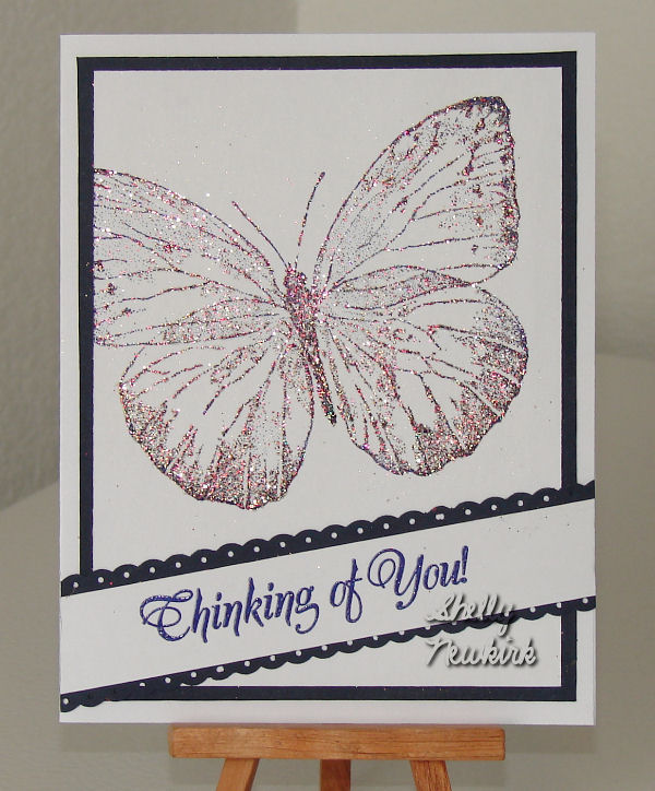
Big Butterflies

 Both butterfly images are from Viva Las Vegas Stamps.
They have been stamped in a dark blue pigment ink
with a extra thick embossing crystals from 
Once Upon A Stamp as the embossing powder.

Since this was a chunky thick powder I heated from
the bottom.  That way the powder doesn't blow off.
You do have to be careful not to scorch the paper.
I believe the phrase is from Our Daily Bread.
It was stamped in the same dark blue pigment 
and a clear embossing powder was used.

The stamped image was cut to 4 x 5.25 inches,
mounted on navy card stock
which was trimmed to a narrow border using
layering rulers.

I border punch was used for the scalloped trim on the phrase.
I don't try to use one piece of paper for this type of work.
I punch out two trims, then attach one at a time 
to the phrase.  Much faster and easier.

Wednesday, January 2, 2013

Clean and Simple Designs

 The only difference in these cards is the stamped phrase.
I stamped a mosaic border stamp using Hunter Green Colorbox
pigment ink and a clear embossing powder.
The phrase was stamped with Colorbox chalk ink dark green.
This little border could be stamped, could be scrapbook paper,
could be an embossing folder, could be polished stone,
could be pearl ex and glue technique.
To me the secret here seems to be
that you use the same paper for the card base and for
the 5.25 x 4 inch rectangle that is under the border.
Also use the same accenting paper under the border and
under the rectangle. 
This paper has been cut to a narrow border 
using my perfect layers ruler.
Am I going to make some more of these type
of cards using my suggestions above, YUPPERS!
I think I need to use some more of my smaller phrases
to create birthday, thinking of you etc.
 
One trick I discovered in placement of the stamped
phrase was to stamp it before I attached the border.
I positioned the border, stamped and then attached the border,
otherwise I was getting the phrase too high on the card 
and it didn't look right.